For months we have run heatmaps on the homepage, and we’ve constantly added improvements to the homepage based on how users have reacted to the changes.
One of the conclusions we’ve come to was that the best option to display their bestsellers first, right below the main slider – instead of other variants (like having their categories with icons displayed).

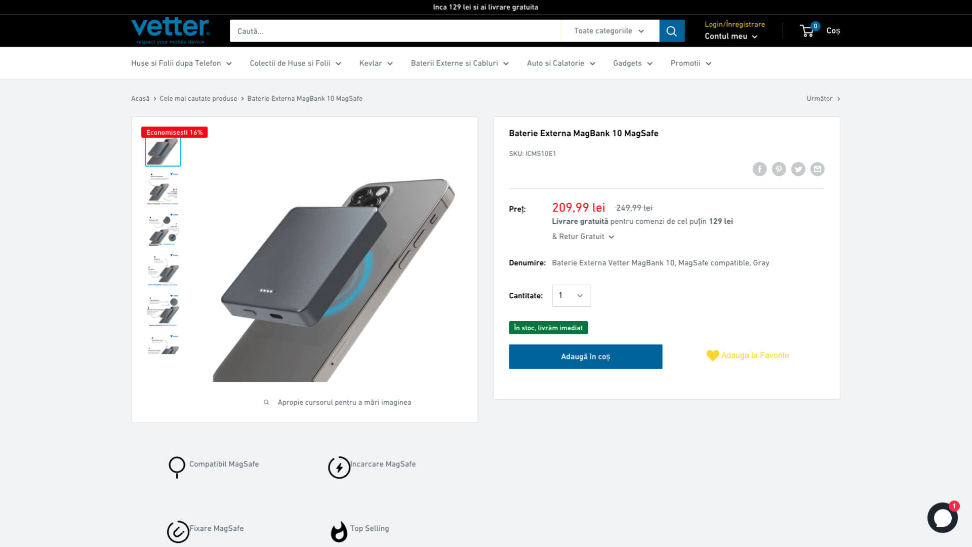
With a feature-rich image display, that provided thumbnails for all product photos, this page has been particularly taken care of.
Since all conversions went through this page, it has also been subject to A/B testing and heatmaps.
Adding descriptive features with icons to the bestseller products, along with well thought through descriptive product images have been some of the improvements generated as conclusions to our long-term studies.
Dynamic image loading has been implemented for speed optimisation and improved user experience.
The third most important page in the whole website was in their case the search page.
This is where all users searched cases, screen protectors and all other accessories compatible with their phone model.
Making the product names short so that they could fit and be readable was one of the many challenges we’ve faced when improving the UX of the website.